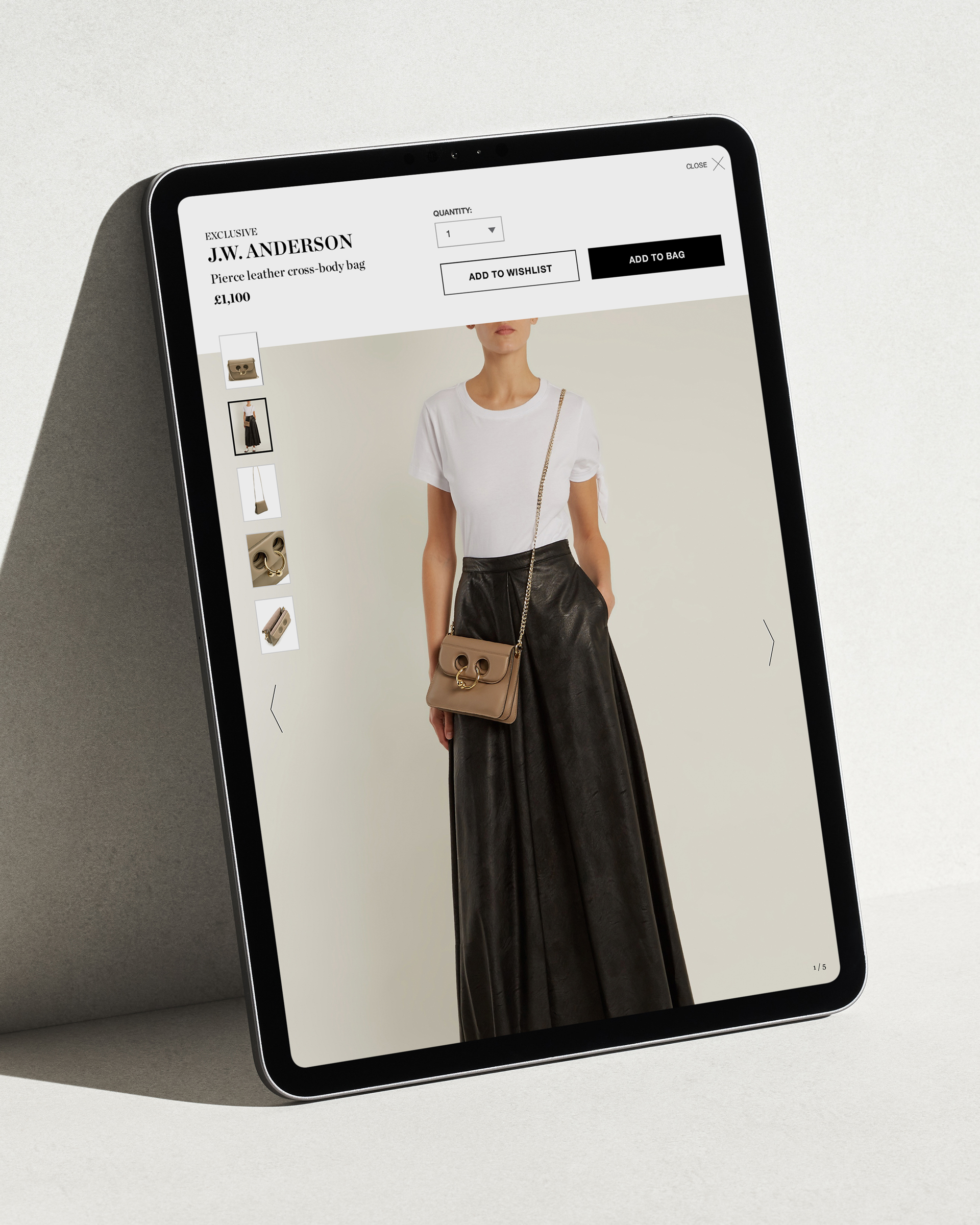
Whilst helping manage the 'business as usual' design processes at MatchesFashion.com, I worked with 2 other digital art directors on the fully responsive re–design of the website, across 4 breakpoints: large desktop, desktop, tablet & mobile. This included a complete design overhaul of editorial pages & components (homepage, magazine pages) as well as functional pages such as PDP, PLP, my account & checkout.
A large part of the re–design was to find a way to archive the many editorial features we pushed weekly. We did this by creating sub sections of the site, allowing customers to browse content by categories that interested them, such as 'vacation', 'how to wear' and 'style opinion' content themes. We integrated easy filtering and the ability to preview 'this week' and 'last week's' editorial features.